Case Study
NESN
NESN
- Promo Packages
- Design & Branding
- Design & Animation

The Challenge
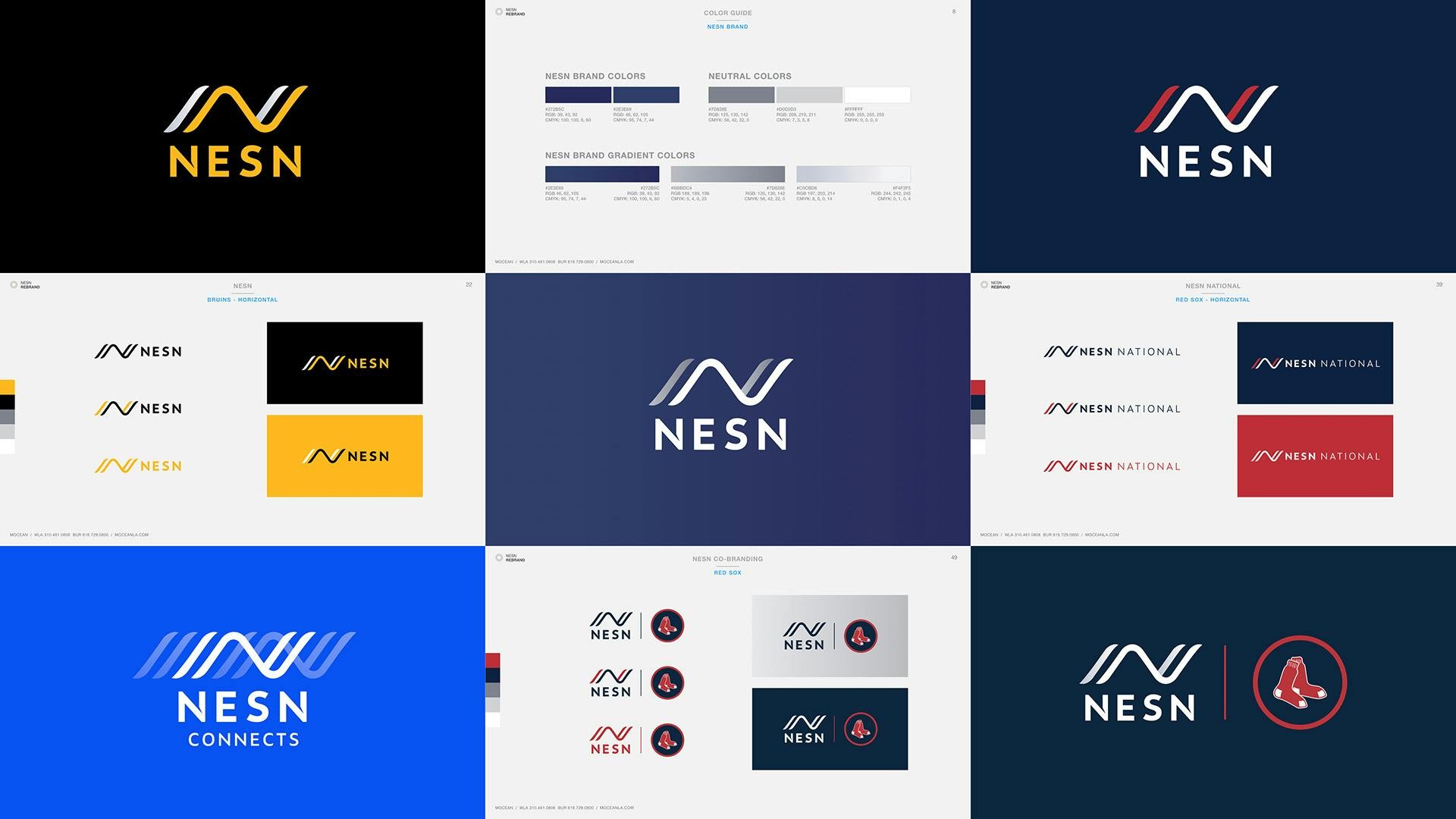
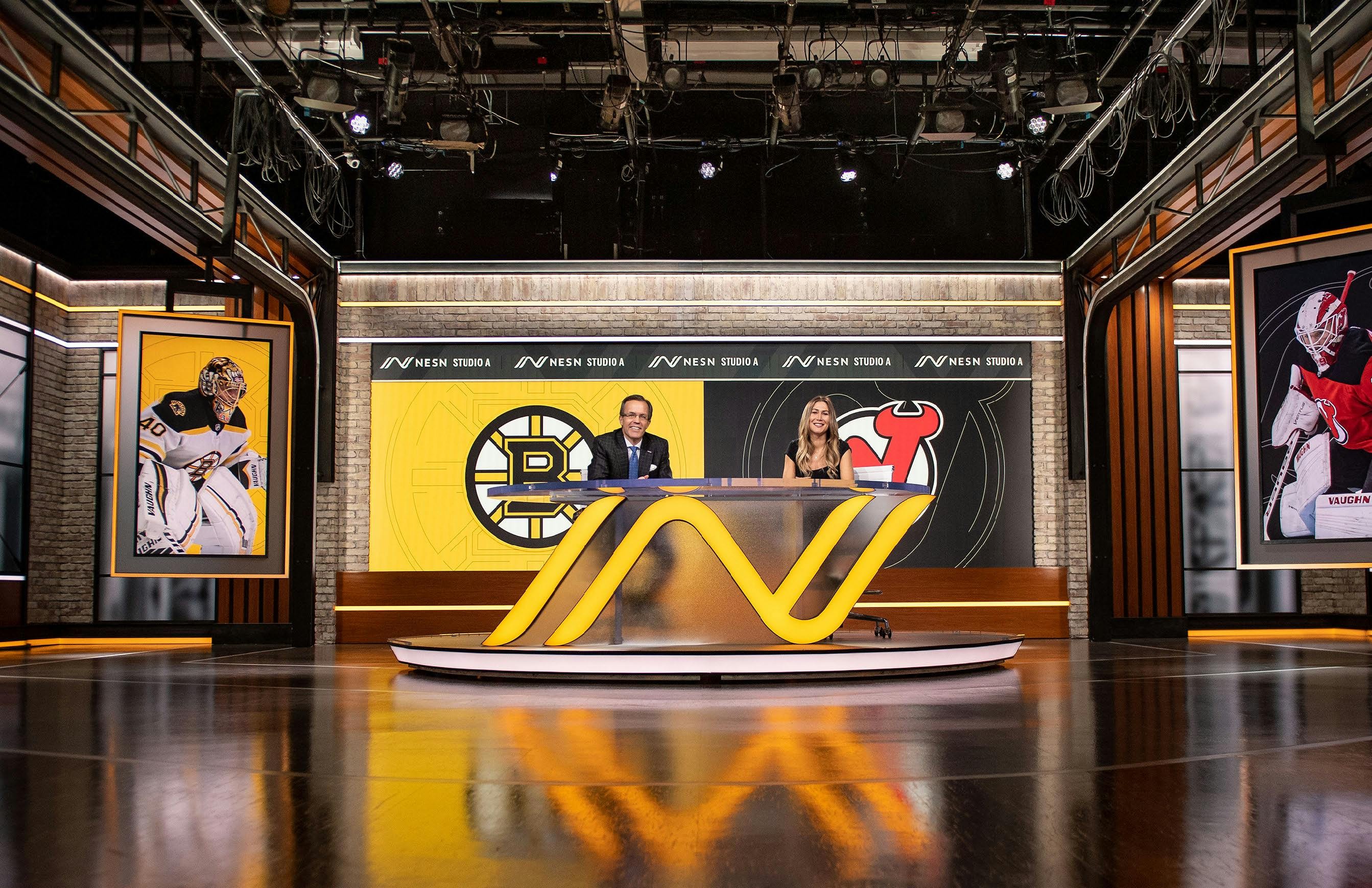
The New England Sports Network, NESN, has used the same logo since 1984. With a legacy that long, the mark is near to a lot of people’s hearts. NESN wanted to update the ticket with an eye towards the future. Since the ticket is beginning to join the rotary phone and floppy disk as a symbol of a distant past, NESN needed a future-proof identity that felt modern, but enduring enough to last another few decades.


Our Approach
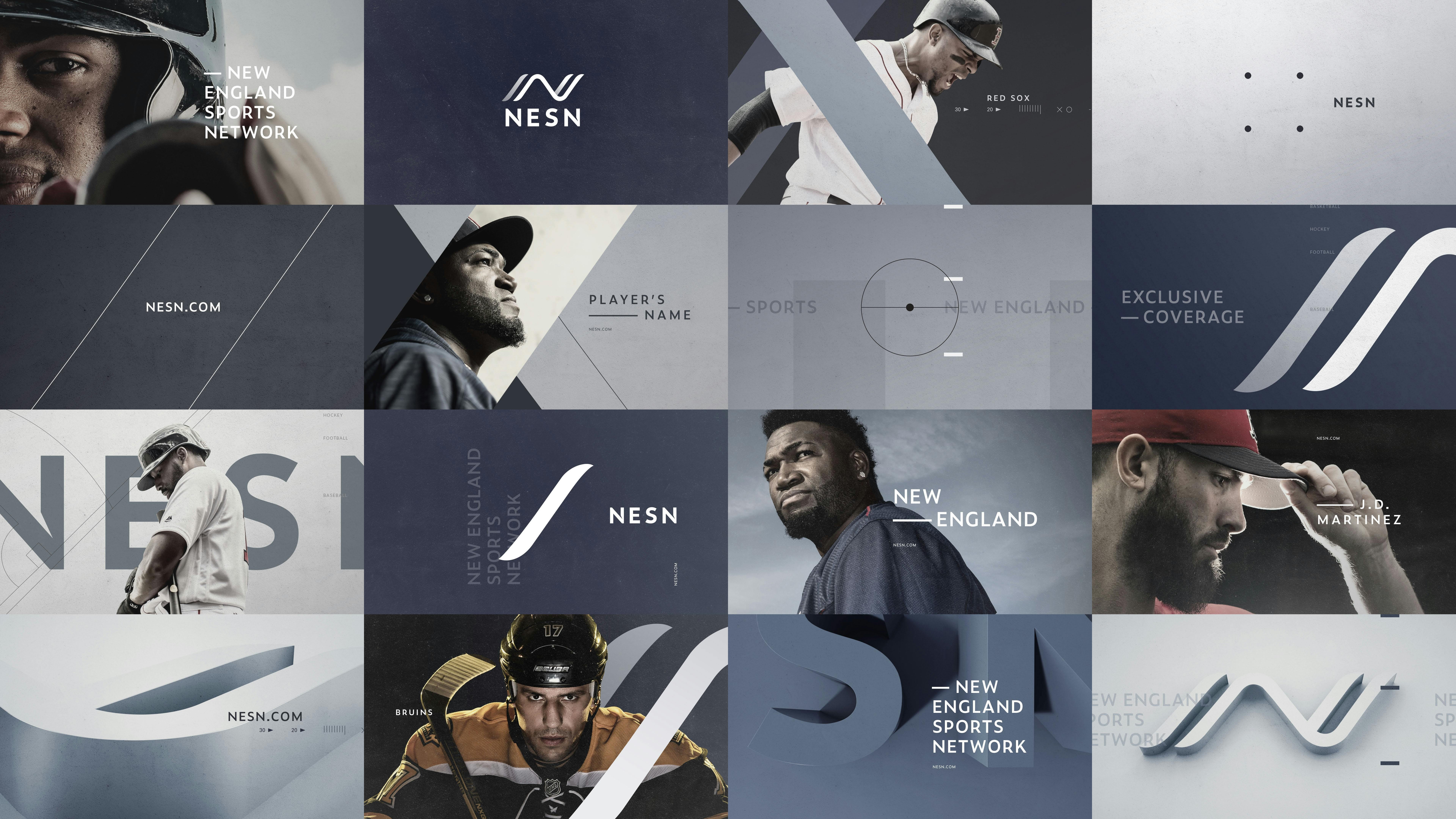
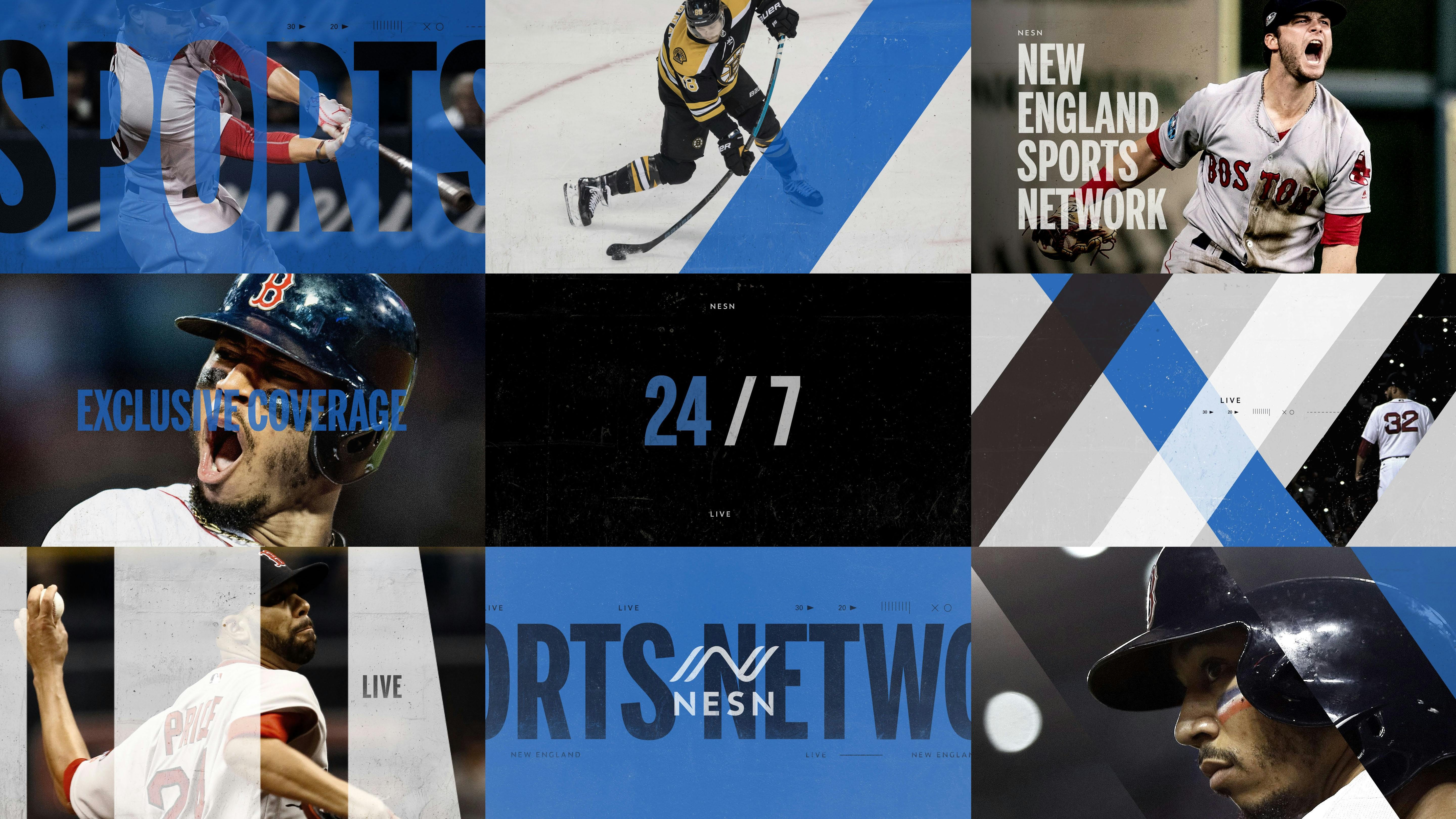
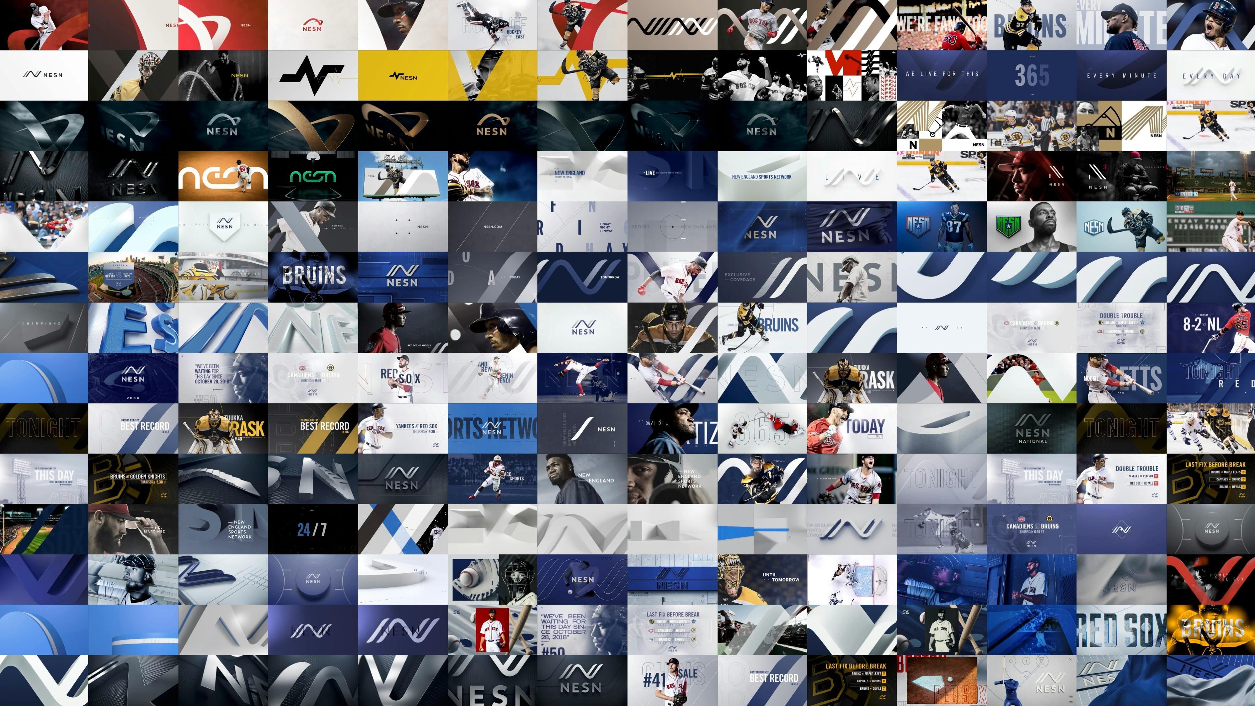
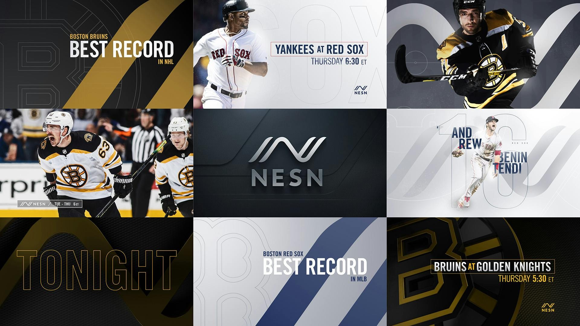
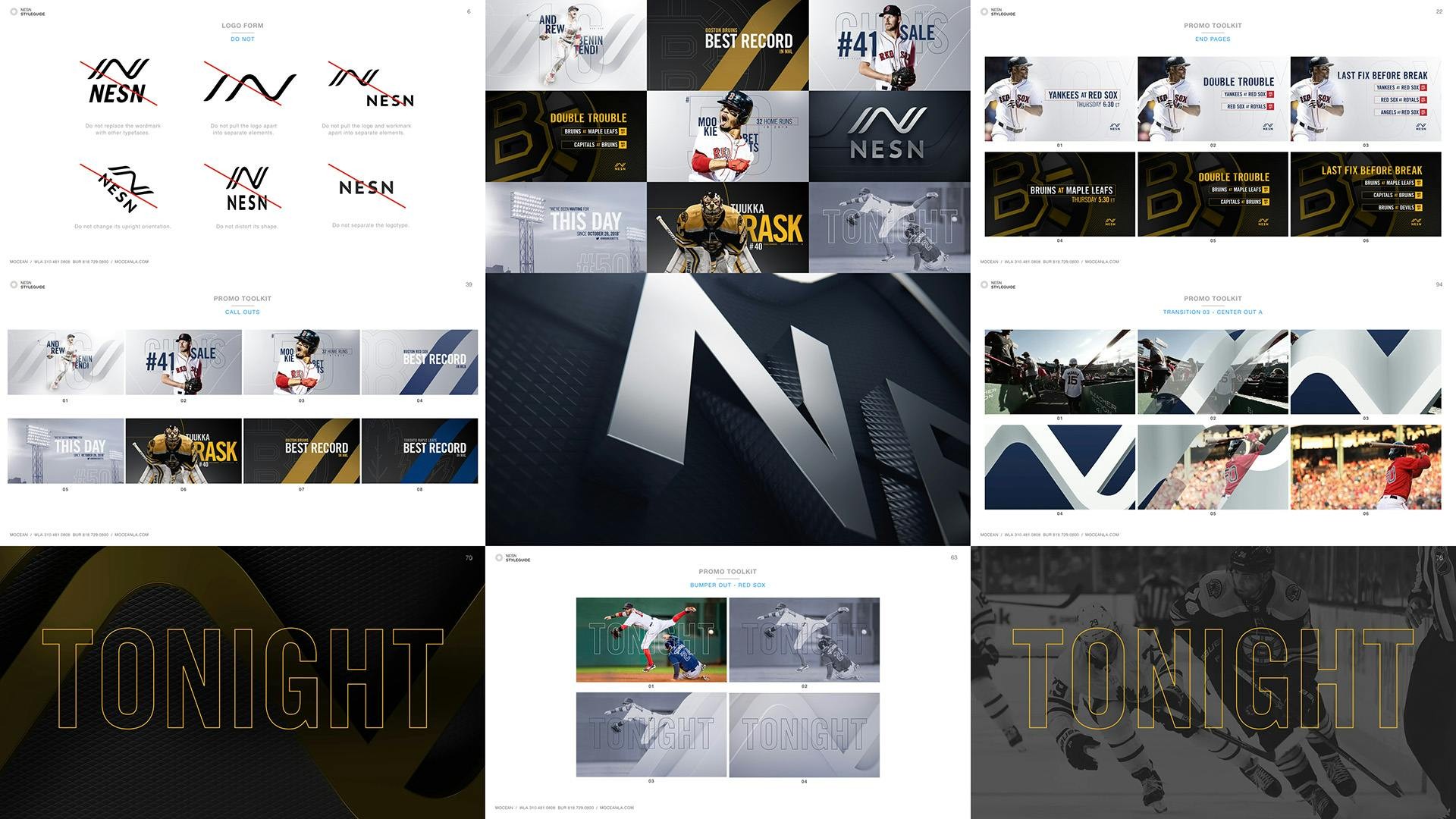
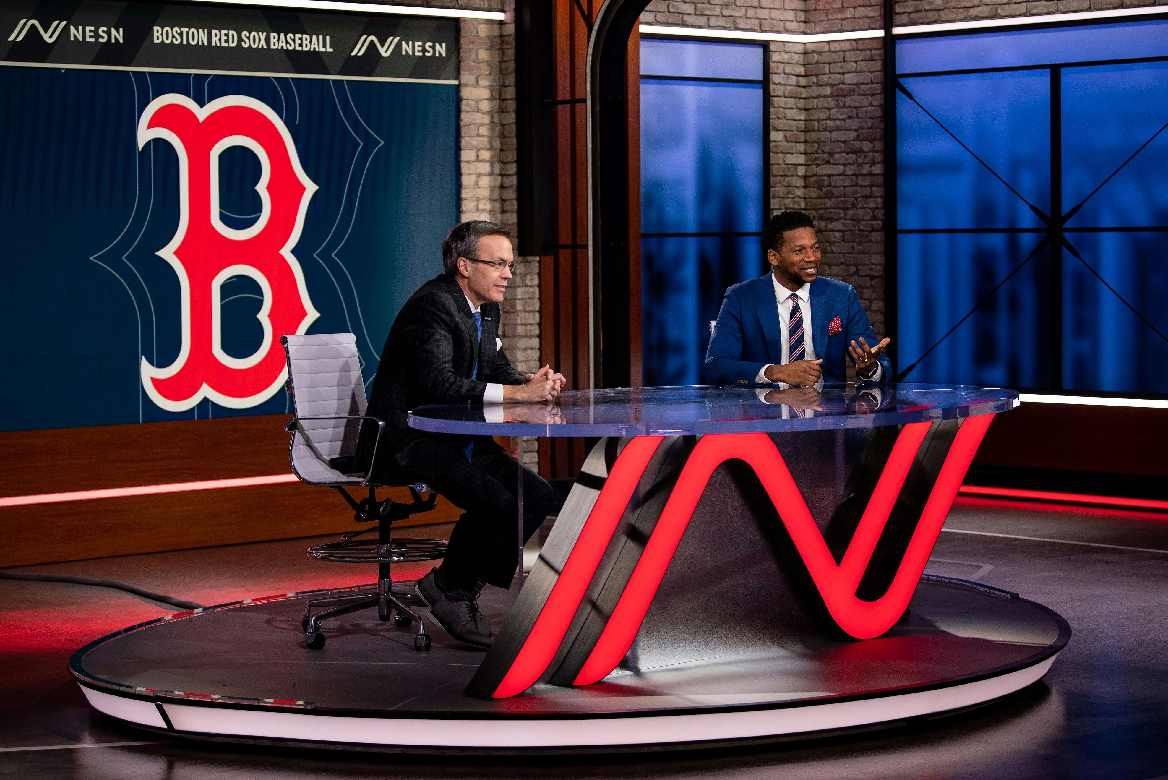
Creating an abstract mark that symbolizes an athletic flow and forward momentum with a connection to the New Network in New England Sports Network marked the evolution of an organization that’s thinking toward the future. Through an extensive development process we worked with NESN leadership to develop the mark and expanded it into every sub-brand and iteration, building out a comprehensive brand guide. From there, we developed the promo and on-air packages extending the brand across the network.
Logo Usage Guide

Promo Package

NESN Branding & Design
Style Guide

Studio


Design Development