Case Study
NESN+
NESN
- Design & Branding
- Promo Packages
- Design & Animation

The Challenge
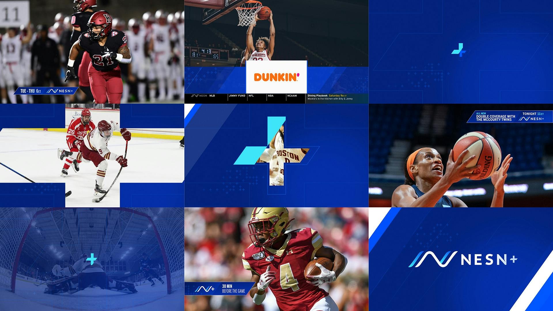
Following MOCEAN’s successful rebrand of their parent network, NESN returned for a rebrand of NESN+. Drafting off the parent brand, NESN+ needed to reflect the spirit of the younger skewing audience for the college sports aired on NESN+.

Our Approach
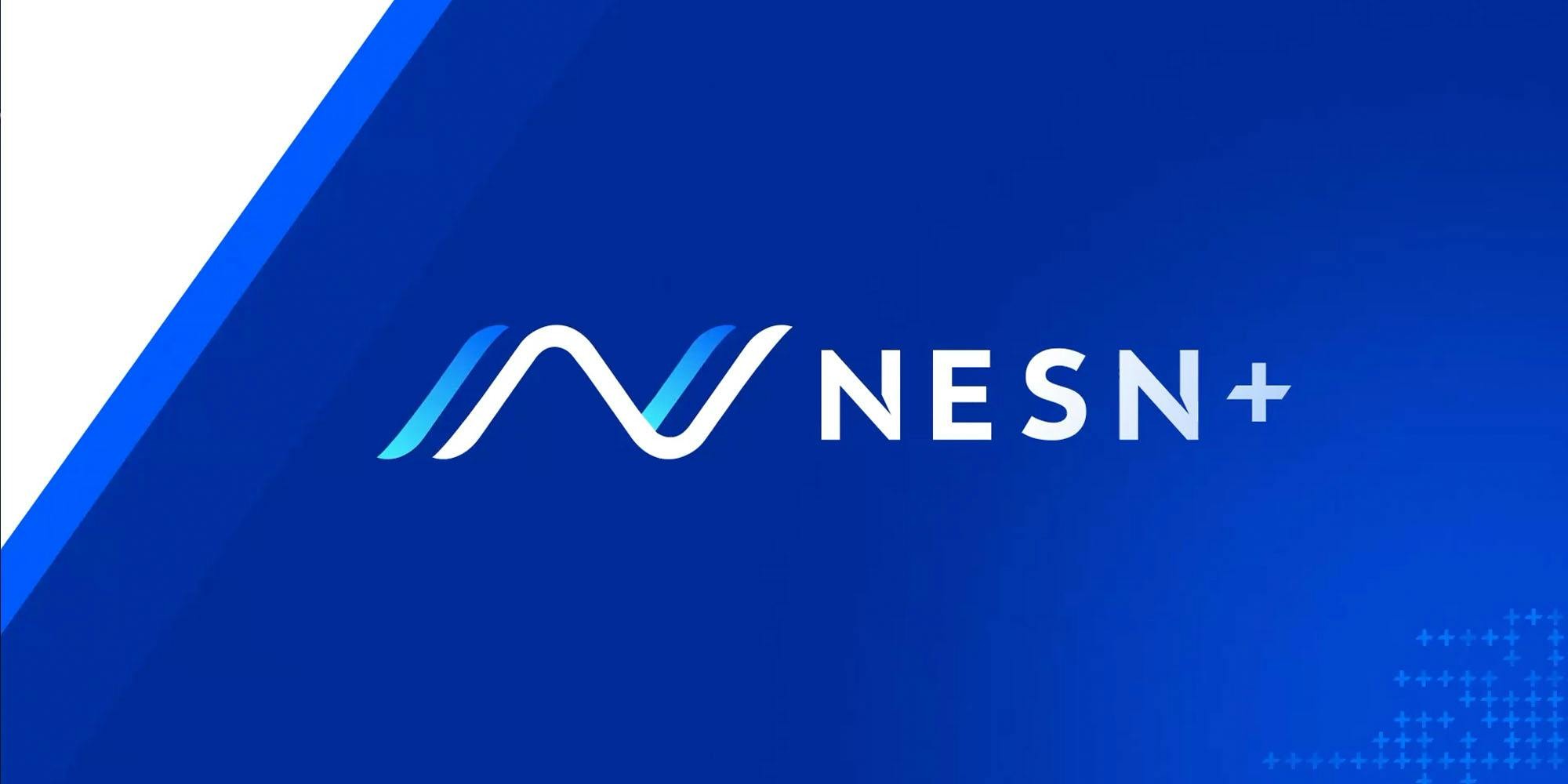
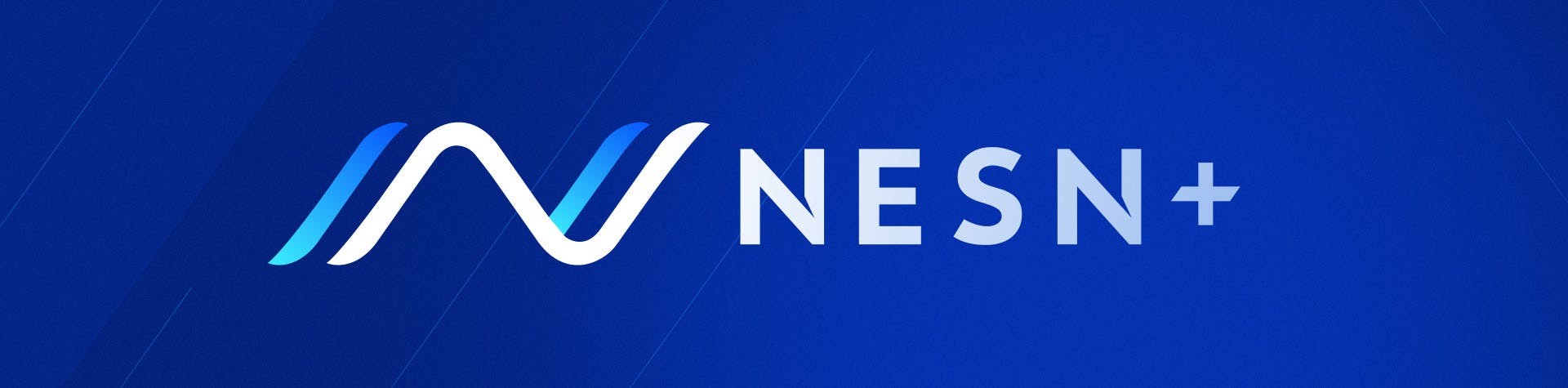
To keep NESN+ in the same brand family as NESN, much of the design language echoed the master brand. Thin outline elements, the NESN mark, and aggressive motion theory all carried over into NESN+. A contemporary type sensibility, vibrant palette, flat color approach and a graphics system designed around the + help distinguish the new brand from the master network.
Promo Package

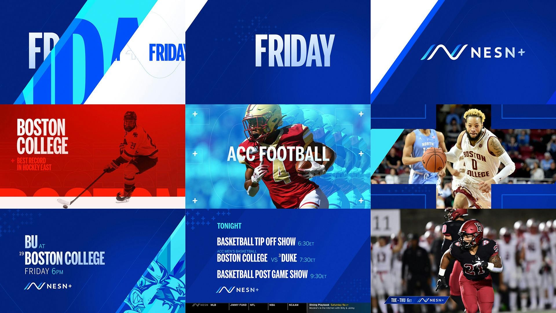
On-Air Package

NESN+ Branding & Design
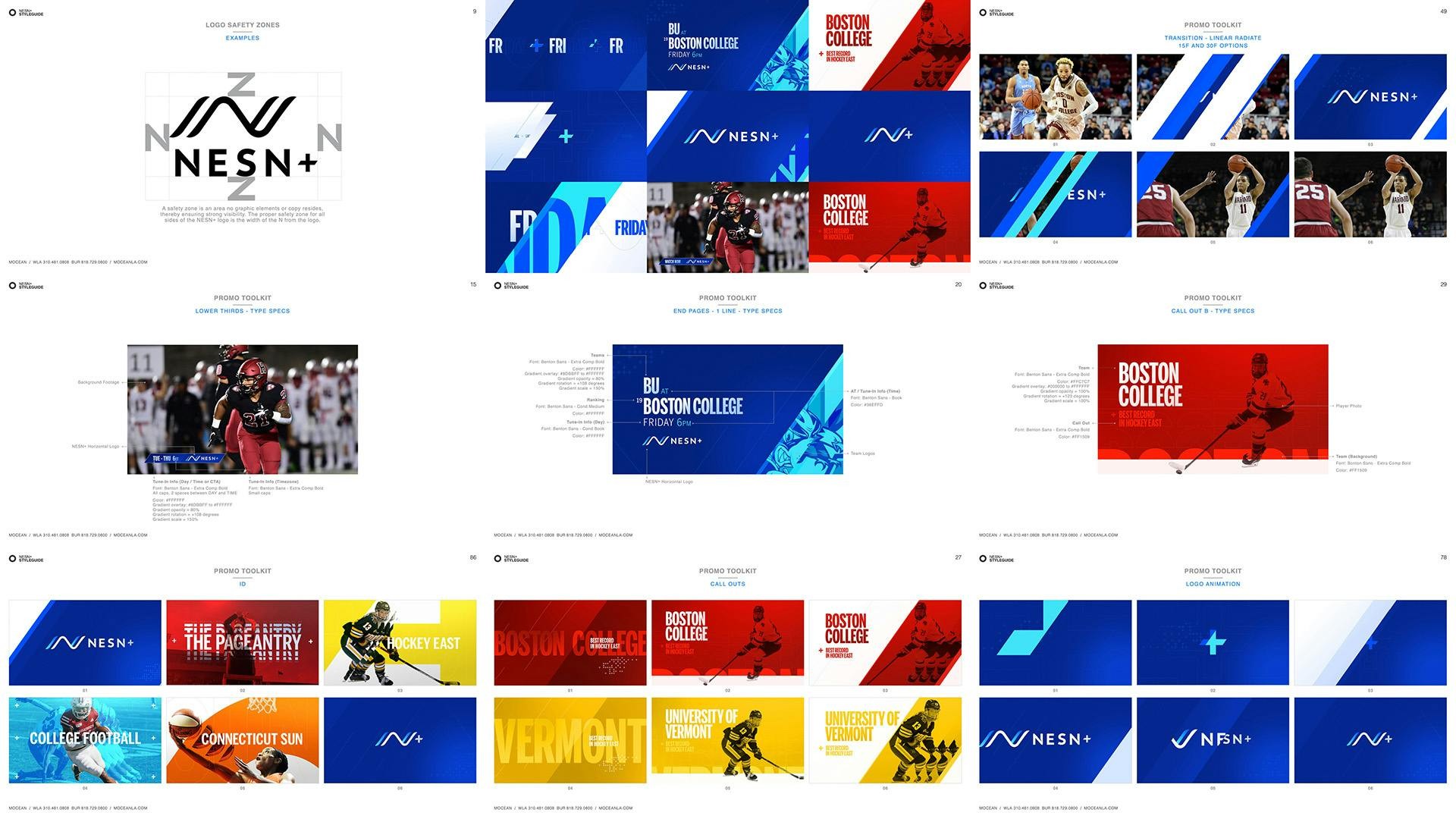
Style Guide