Case Study
The Company You Keep
ABC
- Design & Branding
- Main Titles
- Design & Animation

The Challenge
MOCEAN was tasked with launching ABC’s latest romantic crime series The Company You Keep. A key challenge was to represent the building tension between the show’s opposing thematic forces, while creating a distinct brand identity that would stand out in an overly saturated genre.


Our Approach
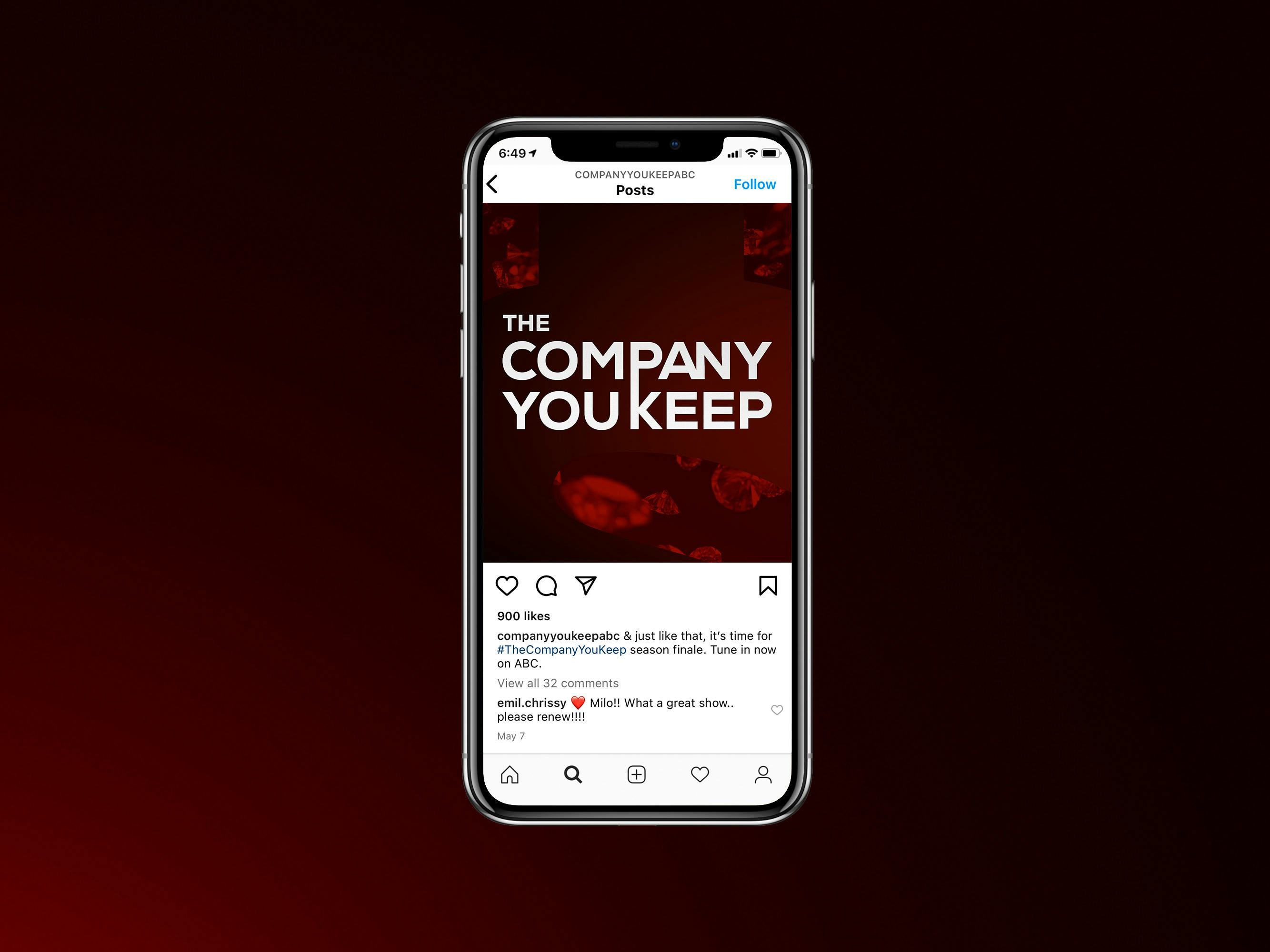
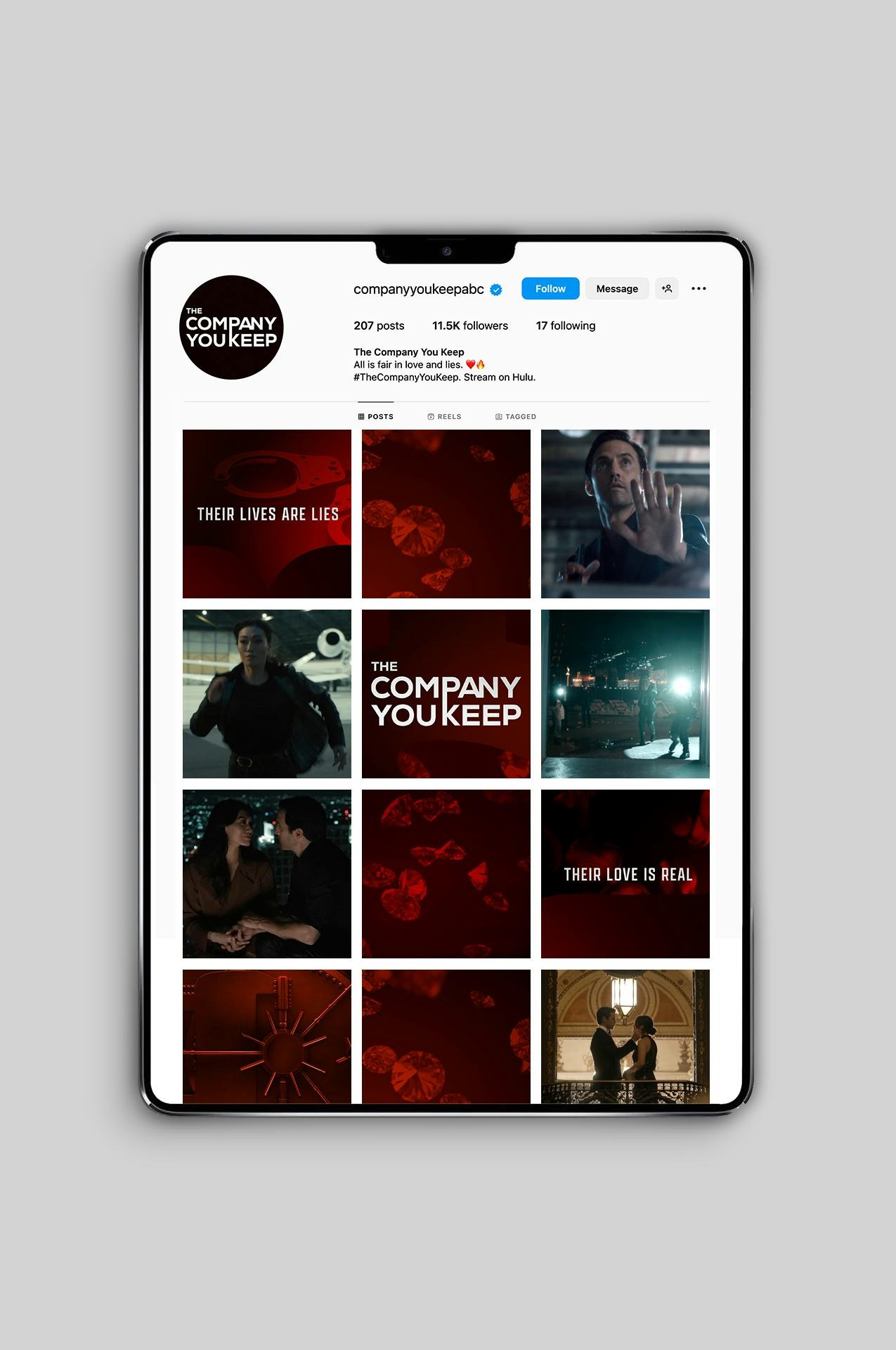
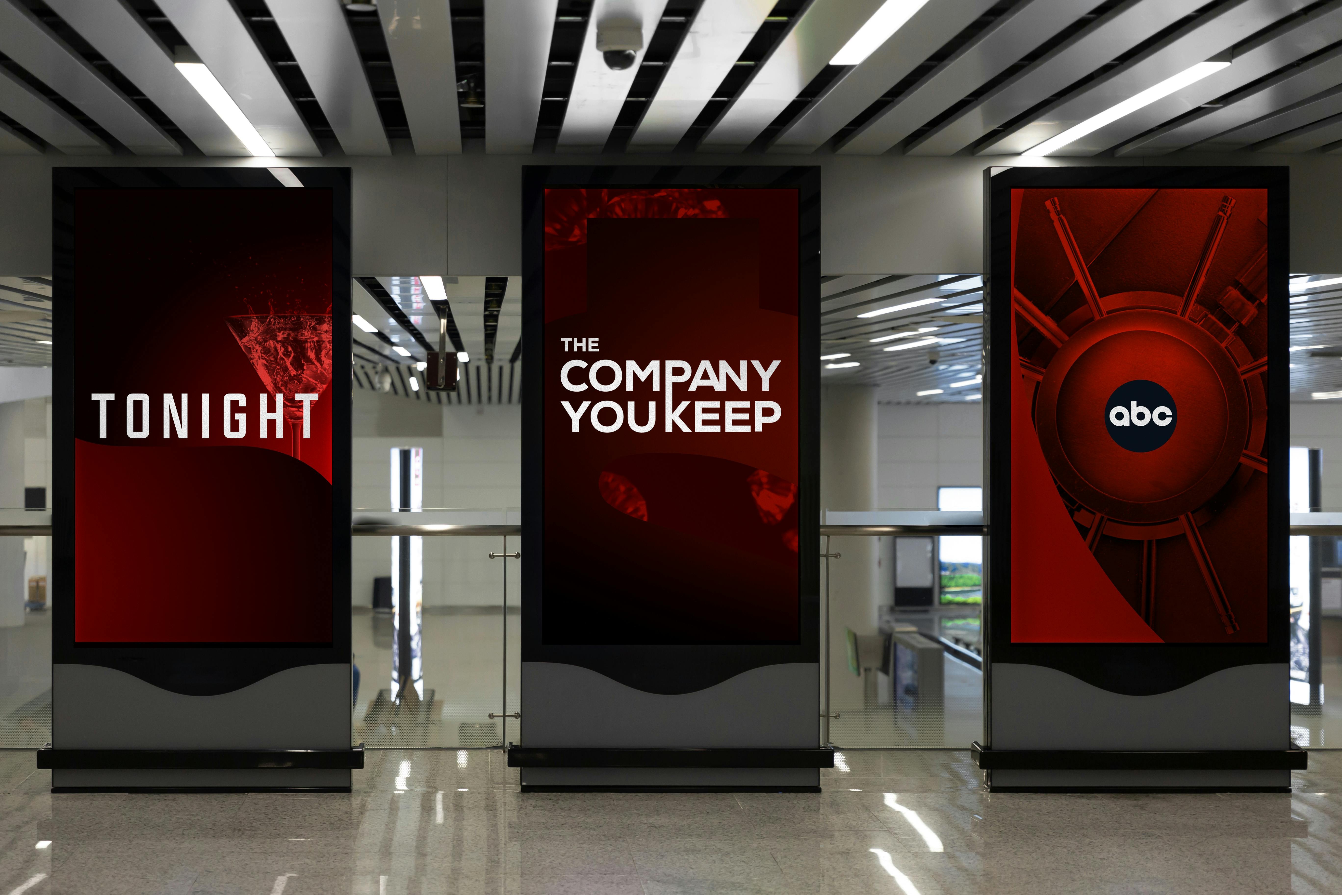
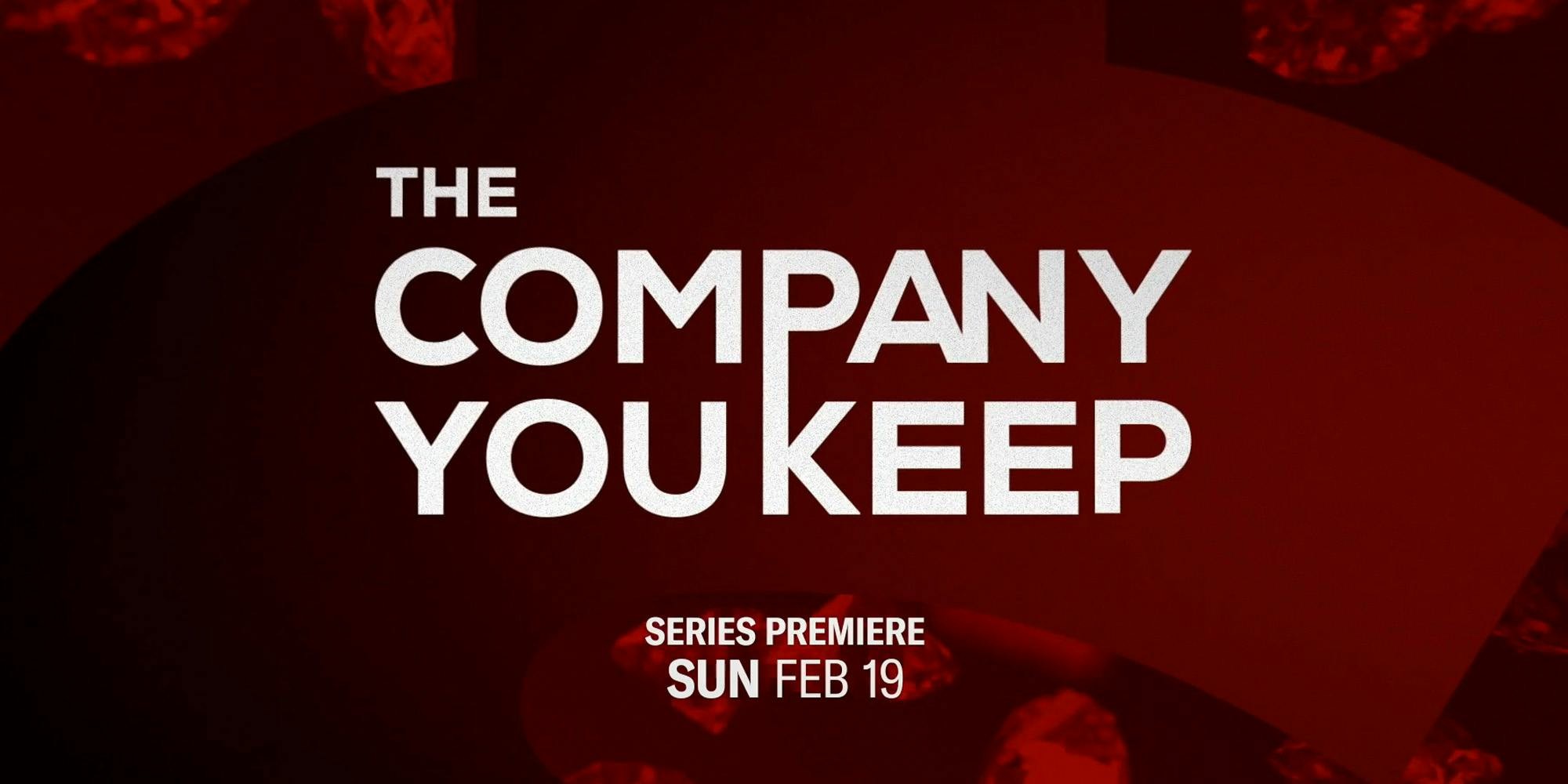
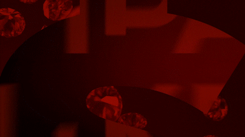
Working closely with the ABC team and show runners, MOCEAN developed a striking visual language for the show. Anchored by a bold red palette, graphic symbols of money and power act as windows to reveal underlying imagery of crime and love. In this way we capture the tumultuous relationship between the show’s lead characters and hint at the powerful opposing forces, pitting them against each other. MOCEAN developed the show logo, launch spots, as well as a graphics toolkit for both on-air and off.
The Company You Keep – Diamonds
The Company You Keep – Tonight
The Company You Keep – Vault
Promo Package


Mobile/Digital OOH